Why reading DataViewer pages instead of conventional web pages?

Yesterday Georgi Kobilarov asked this question reading this blog post about the DataViewer:

“could you elaborate on an example in which the Zitgist Browser / DataViewer enables me (the end-user) to do something I couldn’t do by reading web documents or even do something faster than by reading web documents?”

This is a good and legitimate question. However the first question would be: what Semantic Web documents (RDF documents) are used for? The idea was probably to gives the Web back to machines, so that they can have access and process the data more easily.

In such a vision, the use of such a DataViewer can raise some questions, as you did.

So, what is the usefulness of such a tool to end-users?

If you tell me that your home page contains the same information as the RDF document describing entities (and all the information about them) available from your home page, then yes, a human should read your home page more easily (since HTML documents are built for humans).

But one characteristic of RDF, and we can see it with the emergence of the Linking Open Data Community, is that data (entities) can be linked together, as webpage are.

Entities, so the data describing these entities, are meshed together. This means that my personal profile can be linked to the semantic web document describing the city where I live; it can also be linked to the articles I wrote; be linked to my friends and co-workers; be linked to the company I currently work for; to the projects I worked on and the ones I am currently working on; and so on.

All this information is accessible from one place: my personal profile semantic web document. All the other information is meshed and displayed in the DataViewer. So, instead of browsing all these web pages, you will have all the information displayed in a DataViewer page.

Given this vision of things, I envision that in the future people will craft data: describing things and linking things together, instead of crafting web pages. The data itself will drive the generation (and optimization) of user interfaces that will display that data.

The idea of the current DataViewer is simple: shapeshifting the user interface to maximize the display of meshed data. The same principles can apply to other systems such as emails clients, rss readers, web widgets, etc. What the DataViewer is, is a kind of semantic web data management system. What it produces, for the moment, is an HTML document. But I can assure you that you will see it incarnated in other services and in
other environments.

The DataViewer is not the answer to all problems of the World; however it tries to do one thing: managing the presentation of semantic web data to end-users. At the moment it takes the incarnation of a web page, but it the future it will be extended to other things. What is important is the principles, concepts and vision supporting the development of such presentation and management tools.

But we shouldn’t fool ourselves here: web page (HTML pages) have always been created, developed, crafter for humans. They are optimized for human understanding. An interface such as the DataViewer can’t compete with a will crafted web page. However it can do some things that web page can’t do if it has access to well crafted data sources. It can present, in a meaningful way, information that comes from a myriad of data sources, all in the same page, ready to gives immediately the information the user is looking for.

Zitgist DataViewer

Zitgist is releasing a totally new semantic Web data viewer: the Zitgist DataViewer (on test servers). This new Web service pushes even further the semantic Web data visualization principles initiated with the Zitgist Browser.

The goal of the Zitgist DataViewer visualization tool is to provide a user interface that morphs semantic Web data into a form that can be easily read and understood by humans. The Zitgist DataViewer moves this vision forward in three ways by:

  1. Adding features to help users manage the overload of information published from some data sources,
  2. Speeding up the data visualization process and giving more feedback to users when data sources are being analyzed and documents constructed, and
  3. Changing the templating system to make them cope with a wider range of type entities even if these types are unknown by the system.

In this blog post I will show you all the new features of the Zitgist DataViewer, how it can be used, and how each feature enhances the experience of users.

Main Entity Display Sections

On the semantic Web, everything is a “resource”. A resource can be seen as an Entity, or sometimes also called a Thing. This thing can be a person, an album, a place in the World, etc. Each entity is described by its properties: the age of a person, the name of an album, the population of a city, etc.

The Zitgist DataViewer reads all the information available for these entities, and displays it to the user as best as it can so that users can easily read and understand information about these various entities.

The first step performed by the Zitgist DataViewer is to get information about that entity and to create the Web page that will be presented to users. Figure 1 is the progress bar showing the status of the Web page creation process to the user.

page_load_progress_bar2.png

Figure 1

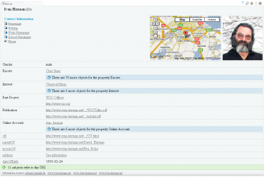
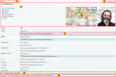
As you can see in Figure 2, each entity is represented in a table. Within each table, information available about entities is displayed to users. Figure 2 represents information available about a person called Ivan Herman.
 

general_resource.png

Figure 2
These are the six main section of a table representing an entity:

  1. Tab. This tab displays the type of the entity. In this case, Ivan is a Person. If the table is collapsed (see section about tools), the name of the entity will be displayed in the tab instead of the type.
  2. General information. This section displays general information about an entity. In this example, since the entity is a person, the name of that person, his contact information, his location and a photo of the person are displayed in the “general information section”.
  3. Tools. These tools are used to perform action on an entity table.
  4. See-more. This section aggregates all the same properties describing a person. By clicking on the “see-more” button, the complete list of properties will be displayed to the user. This feature gives an additional means for users to manage information overload.
  5. References. This section lists all other entities referring to the viewed entity. For example, in this case the references are each entity that “knows” Ivan, such as friends, co-workers, etc.
  6. Information sources. This section displays clickable links to the locations of all Web sites that contributed the actual information displayed in the DataViewer.

Note – depending on the specific type of Entity at hand – there are multiple display formats or “templates” (see below) that structure the content and format of the actual data presentation within the DataViewer.

The General Information Section

contact_information_section.png

Figure 3

This section displays all general information about an entity. General information is typically the information a human would think best describes a particular type of entity. For example, typical information about a person would be name, contact information, location, birthdate, occupation, photo, etc.

Tools

resources_tools.png

Figure 4

These tools shown in the red box are used to perform some actions on the entity table. From the left, the icons do the following:

  • mini-Z icon. This displays information available from zLinks about the entity.
  • Lookup icon. This shifts the focus of the DataViewer to this particular entity. In some cases you may have more than one entity per URI, or you may want to focus your navigation on an embedded entity, and this tool allows you to only see the currently active entity.
  • Up arrow icon. This scrolls the DataViewer up to the page from any entity table.
  • Close icon. This collapses any entity table. By clicking on this icon, only the tab becomes apparent.

See-more

This feature is used to aggregate and hide all same properties. As shown in Figure 5, if the user clicks on the blue button that says that there are 70 more “Knows” properties, then all known properties will be displayed to the user.

seemore.png

Figure 5


On the other hand, if the user check clicks on the “Hide objects” button, this expanded display is then collapsed with the section hidden again.


Inline Embedding

With the Zitgist Dataviewer, users have the possibility to embed entities on-the-spot. This means that they don’t have to open a link in another page; they can do it by embedding it in the current page.

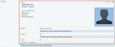
If the user moves his mouse over a link within an entity table, he will see a blue right-arrow appearing. If the user clicks on the normal link (using the example of Uldis Bojars in Figure 6), then the entity Uldis Bojars will be opened in a new page.

On the other hand, if the user clicks on the blue right-array, the Uldis Bojars entity will be embedded on-the-spot.

inline_embed_1.png

Figure 6

If the user click on the arrow, a progress bar will shows the processing, by the server, of the creation of the Uldis Bojars entity.


inline_embed_2.png

Figure 7


This action results in the entity Uldis Bojars being embedded in the current DataViewer page as shown in Figure 8.


inline_embed_3.png

Figure 8


References

On the semantic Web, entities are more often then not referring to other entities. Such a situation arises when I describe the fact that I know another person. So, an entity (me) knows another entity (say, Bob).

The references section of the Zitgist DataViewer thus shows the user what other entities refer to the current one being displayed.

In the Figure 9 we expand the references of the Ivan Herman entity. We now see the entities, known by the Zitgist DataViewer, that refer to the Ivan Herman entity. One reference we see is to Yves Raimond:


references.png

Figure9


Information Sources

On the semantic Web, everybody can describe anything about everything. This means that I can describe things about a person entity, or an album entity, or about virtually anything.

The only thing I have to do is to publish that information on the Web so that people can access it and do whatever they want with the information once published.

The information sources section of the Zitgist DataViewer is used to tell users where the information they are looking at comes from on the Web. So this section displays a link to all the Web pages where we got information about an entity that we display in the DataViewer.

This way, users can check the provenance (so accuracy and trust) of the information they are viewing.

information_sources.png

Figure 10


Paging Tool

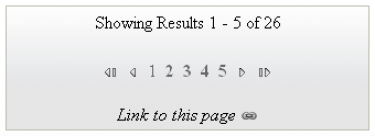
In some cases, there may be more than one resource to display to the user for a given data source. If there are more than five resources to display, results are paged. This is another feature to help the user to manage the overflow of information.
paging.png

Figure 11


Since the pages are created asynchronously (using AJAX techniques), people also copy the link from their Web browser to send to others. To do so, the user simply clicks on the “link to this page” icon and then copies the URL.


Sidebar Tools

Another feature to manage information overload is the addition of sidebar tools:


open_nav_sel_panels.png

Figure 12


The user can click on the first tab to display the “Navigator Sidebar Tool” or on the second tab to display the “Selector Sidebar Tool”. Then he can re-click on these tabs to close and hide the sidebar.


Navigator Sidebar Tool

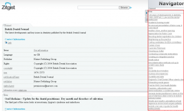
This tool (Figure 13) provides an overview of the entities available for a given data source. All entities are aggregated in the same section of the tool depending on their type (all persons together, all documents together, etc.). By clicking on one of these items the user is redirected to the table displaying information about the entity.
navigator.png

Figure 13


Selector Sidebar Tool

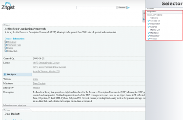
The Selector Sidebar Tool (Figure 14) is used to show and hide entities and properties to the user. By using this tool a user can hide things he doesn’t want to see:
selector.png

Figure 14


This tool can be really useful with some scenarios. For example, if a user only wants specific information from a given data source; then he only has to click on the “Hide all” button to hide all properties and then to click on the property he wants to see. This way, only the desired information will be displayed. In essence, the Selector works as a filtering or faceting mechanism.


The Templating System

The Zitgist DataViewer uses a templating system to organize the data available for a given entity. Depending on the type of an entity (is it a person? a music album? a document? a geographical place? etc.) the viewer will manage and organize the information available for an entity differently.

Each template tries to organize the information such that it is optimized for human reading and understanding.

By example, each template defines which information to put in the General Information section of each entity. It determines how to format and organize that information, how to handle specific things such as images, how to insert certain widgets such as maps and grids, and how to optimize the presentation of other kinds of information.

The only goal of the templates is to make information for each viewed entity more readable, so understandable, by humans.

The DataViewer’s new templating system also manages some properties even if a template is not defined, resulting in a hierarchy of templates composed of sub-templates inherited from upper templates.

This means that even if the Zitgist DataViewer doesn’t know how to organize information of a certain type of entity (because the viewer may not have a template for that type), it can organize other parts of the information based on existing templates and the behaviors of certain special properties.

Currently Supported Templates

There is the list of templates currently supported by the Zitgist DataViewer:

  • Music Ontology templates:
    • mo:Release
    • mo:SoloMusicArtist
    • mo:Track
    • mo:MusicManifestation
    • mo:MusicArtist
    • mo:MusicGroup

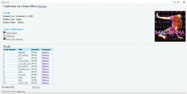
Screenshots:

moalbum.png

motrack.png

  • Description Of A Project Ontology templates:
    • doap:Project
    • doap:Repository
    • doap:Version

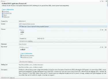
Screenshot:

doap.png

  • Friend Of A Friend Ontology templates:
    • foaf:Agent
    • foaf:Document
    • foaf:Group
    • foaf:Image
    • foaf:OnlineAccount
    • foaf:Person

Screenshot:

foaf.png

  • Geonames Ontology templates:
    • geonames:Feature

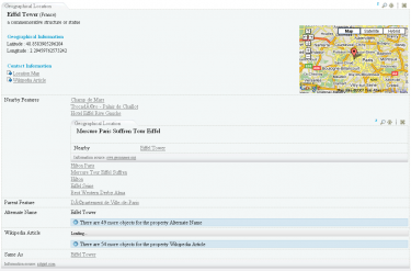
Screenshot:

geonames.png

  • Semantically-Interlinked Online Communities Ontology templates:
    • sioc:User
    • sioc:Container
    • sioc:Forum
    • sioc:Item
    • sioc:Post
    • sioc:Site
    • sioc:Space
    • sioc:Usergroup

Other Ontologies also result in the addition of still more templates, for example: wgs84:Point, wps84:SpatialThing, bibo:Document, rss:Channel, rss:Image, rss:Item, frbr:Endeavour, frbr:Manifestation, rdf:Bag, rdf:Seq, owl:Thing.

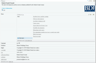
One more screenshot (RSS):
rss.png

The Skinning System

While the templates organize the structure and scope of information about entities, skins manage the appearance of that organized information. The Skinning System for the DataViewer governs which colors to use, which images to use, which dimensions to use, where to place on the screen, and what to show.

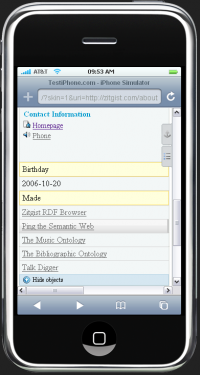
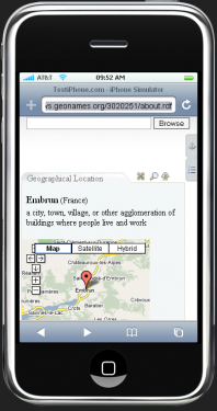
There are currently two skins created for the Zitgist DataViewer. The default skin is the standard appearance of the DataViewer within your Web browser. The second skin – called the mini-Dataviewer – is used to optimize the display of the DataViewer within a restricted area, such as a small container on a Web page or a mobile device such as the iPhone.

Figures 15 and 16 show two entities viewed with this mini-DataViewer interface on an iPhone. As you can see, the information is not displayed the same way, and the user interface and colors have changed to optimize for a small mobile device.
minidv_1.png

Figure 15


minidv_2.png

Figure 6


zLinks within the DataViewer

From earlier posts, recall:

“The zLinks client-side service is an entry point to a vast new world of additional rich data and link-related services […] zLinks automatically ‘turbocharges’ all of your existing and new content links to tap these resources that are contextual, relevant, informative and actionable.”

The zLinks Web service has now been integrated within the Zitgist DataViewer.

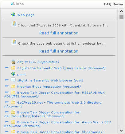
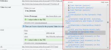
Users now have access to related stuff about every linked entity displayed in the DataViewer. These zLinks provide not only related information about an entity, but also what that entity is about and what also refers to it.

In the Figure 17 we use the zLinks Web service to take a look at the publications (in this example, the talks) linked from the entity Ivan Herman. The service lists all talks by Ivan, as well as provides links to his personal profiles and to the profiles of his friends.
zlinks_within_dataviewer.png

Figure 17


Dataviewing examples

There are a couple of visualization of URIs using the Zitgist DataViewer.

The default DataViewer user interface:

The mini-DataViewer user interface (you will be redirected to an iPhone testing website):

Conclusion

The Zitgist DataViewer is the next step to make semantic Web data more accessible and usable. It is an important upgrade over its earlier version, what had been known as the Zitgist Browser.

We are now learning how to move beyond the “triple” and how to better visualize semantic Web (RDF) information published on the Web. Many new features in the DataViewer help users to manage information overload. Others provide feedback or access to still further useful information. Performance and display speeds have been improved. Organization and a templating system add further flexibility.

We believe the usability of the DataViewer has been greatly enhanced. Still, we are not satisfied. We welcome your feedback and will continue to seek improvements for the next round of enhancements. Zitgist is committed to data usability and ease of access. We welcome your participation as we continue on this quest!

The next version of the Zitgist Browser: enhancing users experience

I have been to Boston last week and I finally met many people of the semantic web community; people I was working with for more than one year now. I had a great time with them talking about the semweb, where it is up to now; what are the next challenges, etc. One of the activities I attended to is the RDF and DBMS integration workshop in Cambridge; Presentations (slides) are available here.

However one question was asked from time to time: what Zitgist is developing now? What are you guys working on at the moment?

Well, on many things. The latest release by Zitgist has been zLinks; but our developments efforts haven’t been restricted to zLinks. So, what are these other things? Well, one of them is the second version of the Zitgist Browser.

I think the current version of the browser is good; but it is not good enough. After using it for some time, we outlined a list of things that has to be fixed/developed to increase the usability of the browser and the user experience. So we focused our efforts on three points:

  1. Adding features to help users manage the overload of information published for some URIs.
  2. Speeding up the browser and giving more feedbacks to users when URIs are being analyzed and documents constructed.
  3. Changing the templating system to make them easier, and faster to develop; and to add flexibility to handle some properties of some, a priori, unsupported types by the browser.

The goal of this coming release is simple: enhancing users experience of browsing RDF data.

The challenge is not an easy one. First, people can describe anything in RDF. Some RDF documents are not valid according to restrictions of some ontologies. Others are some kinds of bags describing, anything and everything at the same time. Some URIs are really rich in information and are well linked; others are really poor and are not linked at all. Some documents are megabytes long. Etc.

The challenge is to create a system that evaluate all these different resource(s) at the same level and try to present the information in the same useful way. In some cases users have to get tools to manage the information overload of some data sources; but in all cases the information displayed to users has to be quickly accessible and understandable by humans.

These are the goals we focused on for the development of the next version of the Zitgist Browser. This is what you will be able to experience in the next weeks or so. I think that this next version will be a good step in that direction. But in any case, the challenge is just starting.

Turbocharge your Links with zLinks

zlinks_logo_175.gif zLinks will turbocharge the links on your web pages. It will unveil the power of the connections you make.

The story goes like this:

The essence of the Web is the link. We use it to navigate, discover, form communities and get rankings on search engines. But, each link carries much more behind it than what has generally been exposed.

zLinks is a client-side service provided as a simple plug-in to turbocharge your links. All links embedded in a blog post or its comments, or from within a content management system (CMS), gain immense power to link to and display additional related data and information. zLinks thus becomes a jumping off point for additional exploration and learning.

Site authors merely install the free zLinks service plug-in and their users and readers gain the benefits thereafter.

A New Service and WordPress Plug-in

Three weeks ago I introduced the Zitgist Browser Linker. From the basis of this prototype we now have: created a new brand called zLinks; enhanced the underlying web service that powers it; and greatly enhanced the initial WordPress plug-in.

zlinks_main.png

Some Basics

We should remember what zLinks does:

  1. To visit Web pages and locations
  2. To potentially take actions (say, buy or search), and
  3. To retrieve data resources.

It is that simple.

So, what is really new with the new and improved zLinks, other than a cleaner and more usable user interface with its new icons, details, scroll bar and better linked resources results?

Annotations

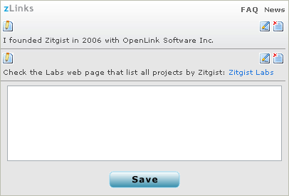
With zLinks, we wanted to take a first step toward editing and publishing stuff on the Semantic Web. We wanted to let people annotate their embedded URLs with some thoughts, some remarks, etc.

Remember that I said, in my previous blog post about zLinks, that each URL is in fact a URI, potentially an identifier for a resource.

So, with the zLinks WordPress plug-in, people now have an easy-to-use tool to annotate resources from within their blog posts.

zlinks_annotations.png

In two clicks one can say anything about any resource he links to from his blog post. Simple? Yeah it is (at least I hope it is).

Annotating resources is simple, however when we start thinking about what is going on under-the-hood, when we start thinking about the architecture used to publish this data and make it available on the Semantic Web, things start to get more complex (and, more fun ☺ ).

Publication Architecture behind zLinks Annotations

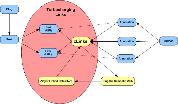
First of all, zLinks archives all annotations on the local instance that is running WordPress (in the case of the WordPress plug-in). Then, if the author chooses to share his annotations, then they can be made available in RDF, with dereferencable URIs, in multiple forms, using the Annotea ontology.

URIs Generated

Three kind of URIs are generated by zLinks:

  • URI for the resource representing the author (note that this can change with preferences, more on this below)
  • URI for the list of all annotations from a blog (will only list the annotations that are shared)
  • URI for a single annotation

These generated documents are then used to publish the information to anyone who wants it.

Why Are the URIs Still Ugly?

The goal is make the installation of the plug-in as simple as possible and to make sure it is compatible with any WordPress installation. Since I didn’t want people to have to mess with the configuration file of their web server or to create URL-rewrite rules such as the ones on the Apache server, we left the ugly URIs as is.

(But, stay tuned, everyone always prefers a pretty URI!)

Consuming Annotations Data

The first service that consumes the zLinks annotations data is Ping the Semantic Web. So, each time a new annotation is created or updated (and assuming that the author has chosen to share his annotations), zLinks will send a ping to PTSW so that still other services can be notified of this creation or updating.

The zLinks web service (which is what sends the links to the zLinks WordPress plug-in) communicates with PTSW to get the latest created and updated annotations. Once zLinks gets this list of annotations, it then indexes them in the Zitgist Linked Data Store.

Then, once indexed by the system, the annotations are processed by zLinks and further aggregated with other resources for other zLinks. So, if I annotate a URI A and if another author puts a zLink for this same URI A, then he will see my annotation, on his blog, for this specific embedded link.

More than Annotating a Web Page

This goes way beyond merely annotating a URL. In fact, I can annotate a URI referring to a resource describing a person. That way, I can say something about a person directly from my blog. So, I can annotate (say something) about a place I link to, about a person, about a book, about a music album… Amen!

(By the way, see the orange underline with those zLinks “mini-Z” icons? That means the link is annotated. Mouse over one of the icons to pull up the zLinks popup and its annotation. You can then see what I mean about the power of these annotations. And, yeah, there is also much else hiding behind the different icon types and backlinks you see in these popups! Go ahead, explore . . . )

zlinks_environment.jpg

The most beautiful part of the story is that the author only has to annotate a link using the zLinks easy-to-use interface, and all the other magic is done automatically, without any human interaction.

Links are made by themselves, data is published by the user’s publishing software (WordPress), the data is broadcasted (multiplexed) to web services and user agents using PTSW, and the data is re-used by zLinks via ZLDS. Wow!

All in 2 user clicks! Can you say Cool?

How to Annotate a URL

As a blog author, if you are logged into your WordPress instance, you will see two icons instead of one when you are viewing the blog post you wrote.

(Note, only you as the author see these two icons; standard visitors do not.)

zlinks_icons1.png

You only have to click on the first of the two icons to see the annotation window appearing beside the link. Then you fill in the annotation writing box and click the “Save” button.

That is it; it is that simple.

Configuration of zLinks

To gain this sharing power, the blog owner must do a simple configure of his zLinks plug-in. First, he has to determine if he wants to share his annotations with the World (the “public” option with notifications via PTSW, what I explained above), or if he wants to restrict his annotations as “private” so that only his blog readers can read them.

The other thing a user has to configure is the identifier he will use as the reference to himself as the annotations author.

There are three choices:

  1. The author doesn’t have an existing ID, and wants to use the default one provided by zLinks. With this option, zLinks assigns a simple numerical identifier generated by WordPress,
  2. The author does have an existing ID (URI) and wants to use that as identifier. That way, his personal URI (usually the one he uses to refer to himself on the semantic web, such as his FOAF profile URI or OpenID), will be to one that links him as the author of his annotations, or
  3. The author starts by using the default URI by zLinks (#1), but later wants to create a better personal URI (#2). In this case zLinks will create a special owl:sameAs link between the default profile and the new one so that once the personal URI is created all prior annotations get the good treatment too.

These simple things are the only ones a blog author has to configure to make the zLinks plug-in work as he would like. Much more information about these configuration options and other topics is available in the FAQ.

Must Read!

The best introduction you can read is from the home page of zLinks.

The best way to see how zLinks is working in its smallest detail is by reading the extensive FAQ. (Actually, even better is to install it!)

Some Use Case Examples

Download

You can download from here and install zLinks in your WordPress software.

Conclusion

So, turbocharge your links on your blog to show the power of their connectivity to your blog readers.

This is an example of how semantic web technologies and concepts can be leveraged to add value to web services and to enhance users experience.

(By the way, I’d like to thank Mike Bergman for letting us use some of his text from his earlier blog review; and for revising this blog post grammar 🙂 )